In a previous post, I referenced the Sunburst visualization, which makes allows users to interactively explore a decision tree in its prediction, the confidence in the prediction, and the split field at any given node in the tree. It does not also give the full (expected) class distribution, so some information is unnecessarily lost. The viewer can guess at the distribution by looking at children nodes, however. In general, I think this is a clever and well-made decision tree visualization because of its use of space, but as noted, it might not be very useful. Here is a sunburst with more labels. For this task, at least, the labeling scheme harder to read then equivalent horizontally aligned design. There should also be a legend for split fields, and for the classes when in the appropriate views.
Interaction can be dangerous, in my opinion, because it transforms the presentation of data into a tool for exploration. If it is treated in the same way as static visualization, it can mislead both the creator and the viewer by leaving the most important information to be discovered, rather than sought after beforehand.
Static visualization freezes points in the exploration process. If I am sorting through many histograms and find one particularly interesting, I will save it or add comments in the IPython notebook. When I then go to present my data science work, I will pick out the few static visualizations I want to make an argument. I do plenty of the same exploration that interactivity facilitates, but I am aware of exactly what I'm doing through the commands used.
Interactivity can be used for seamless exploration of a data set, but exploration is only one step of the data science process. My working hypothesis is that interactive visualizations should never be used as a final form, because it passes the burden of interpretation onto the user. Figures ought to support a prose argument. It is not that users should be left to decide for themselves - for that they too should have access to a data set. Rather, the creator must know what exactly is being said. I fear that the ease of exploration gives a false sense of security and leads to incomplete thoughts. If it's so easy, one could always go back an look at it again. It also reduces the burden need to arrive at the most important information quickly. The presentation of data can be distributed over many potential views, instead of concentrated in a single one. We might feel that we can escape the information loss of compression by creation of a network of connections between all possible frames or data views. In doing so, we might forget that effective communication depends on compression. We want to be informed quickly, accurately, and with high confidence that we are learning what is important, rather than being presented with all of the data.
So what exactly is interactivity in visualization? My curmudgeonly view is that it is decompression allowed by ease of transition between data views. As a form of exploration, it's great, but danger lies in its shiny animations.
Friday, December 18, 2015
Visualization Primitives and Data Correspondences
Would a formal ontology for data visualization be useful? Could it either improve our existing visualizations or point to new possible ones? I think analysis and improvement of existing visualizations is tractable and mostly understood. From my perspective, there is plenty of work to be done just applying the few criteria I've described for model introspection and all of the design thinking that Tufte has proposed, especially in "The Graphical Display of Quantitative Information". Building tighter correspondences between visual representation and underlying data I believe is tractable by examining visualizations we have. A systematization might highlight gaps or unimagined combinations of complementary elements such as the relatively new Sunburst visualization, which organizes hierarchical information radially. But if this is the only potential use, a list of design elements may be more desirable and much less work than a formal ontology in its ability to find new combinations.
For this reason, I'd like to look at parts of visualization that are primitives or nearly so. We'll make a first-pass partial list. Visual elements should correspond to the data sources they represent. We should appreciate the value of intuitive correspondence.
These are the most obvious visual forms that I believe are intuitive to interpret. I will add to this list if I think there are more, but it may be very small overall.
For this reason, I'd like to look at parts of visualization that are primitives or nearly so. We'll make a first-pass partial list. Visual elements should correspond to the data sources they represent. We should appreciate the value of intuitive correspondence.
- Points in space should represent single samples
- Symbols rather than dots should correspond to categorical values or different classes
- Words can function as symbols inside the data space, or data themselves, but are labels outside the data space
- Line segments
- If aligned with an axis, they represent scalar values
- If arranged parallel to others, they are compared scalar values
- If connecting two points, they represent a relationship between those two points
- Points in a 2D space
- May represent a sample in a 2D projection
- May be points along a function in that space
- In a graph, positional information is less informative but points should be arranged to ease reading of relationships
- Without axes and not in a graph, positional information, usually through proximity, should express a relation with other samples
- Curves express a function, or a boundary in the data space, but these are analogous
- May also substitute for line segments in graphs
- Areas
- Multiple rectangles with one edge aligned and of constant length should be interpreted as line segments
- Rectangles naturally represent the product of two variables if aligned with orthogonal axes
- May also represent a fractional component of a larger whole
- May be appropriate over divided line segment/stacked bar/compared parallel bars in some cases, especially in hierarchical division of a quantity to give more space for labels
- The danger is in imputation of meaning to the spatial arrangement of the subdivisions
- Non-rectangular forms should not be used to compare single scalar values
- Unless these forms have some underlying 2D nature
- One may have a desire to plot circles with area (or diameter) representing scalars. These are difficult to compare visually, and should be avoided in favor of rectangles.
- Other geometrical objects are even worse
- Colors
- From a discrete palette represent distinct labels, which should have accompanying text
- From a continuous palette, represent a single continuous variables, which should have accompanying color bar
- At some point, I'd like to illustrate a more complex idea with hue and color value representing two orthogonal dimensions, such as correlation with a positive or negative output class and strength of correlation. The space above the added V in this figure shows a color space with decent differentiability of points and intuitive interpretation.
 |
| Edited Wikipedia example of cross-section of HSV solid |
- "Small Multiples"
- Visual distinction and comparison between similar objects
- Parallel and tiled items are interpreted as analogues with differences in features
- You could browse through all of Mike Bostock's examples and not come across something as funky as Chernoff faces, but they are an example of small multiples
These are the most obvious visual forms that I believe are intuitive to interpret. I will add to this list if I think there are more, but it may be very small overall.
Friday, December 11, 2015
Multidimensional Scaling
I have a working hypothesis that Mike Bostock and others care more about producing many aesthetically pleasing visualizations than meaningful and useful ones. When changing just a few lines of code is all it takes, this is reasonable, but I wish a bit more analysis would be devoted to their formation.
Is multidimensional scaling useful? The raw data form is an adjacency (discretized, usu. binary) or distance (continuous, inverted from adjacency) matrix. If we use a cluster detection algorithm on our distance matrix, we can sort it into groups and arrange the elements to relate adjacency and closeness on the axes. Here we have one such sorted adjacency matrix by Mike Bostock on the co-occurrence of characters in Les Miserables.
With fewer than 100 elements, this approach can work well. We can recognize the existence of clusters in the data, and begin to look between clusters if there are concentrations of adjacency or low-distance off the major diagonal. The cluster detection algorithm sorts the character Valjean into the green group, but we can recognize a concentration through him with the purple group. Several characters in the yellow group also have relation to the purple group. These concentrations will likely be sparse in most data sets, so this method of finding relations between clusters should hold up well. Between 100 to ~500 elements this matrix display could still work, but should make use of shading and blurring rather than discrete boxes to preserve space.
Could we map from the values of an adjacency matrix to Euclidean distances of element on a graph, a preserve the information we have? Properly, no. We lose information because the system is overconstrained by the distances between all of the elements. We only preserve clusters, and a binary form of close v. far. With many classes (clusters that should arise), and many features, the probability of high 'tension' or poor solubility of the mapping to distances on the embedding grows. This tension happens when an element or cluster both pushes and pulls from different elements in another cluster. Compression of a distances in N-dimensional space to two dimensional space necessarily loses information. In practice, we can not learn useful information between different values of 'far', only if a pair is close or far. Does this hold up?
Here, we show the same data as above, in another visualization by Mike Bostock, called a Force Graph, which is a form of multidimensional scaling. Unfortunately, it appears that the clusters have different color labels.
What useful information can be gathered here? With a mouse-over labeling of the characters, we might learn a bit more, but this is too cluttered. Before, I had the impression that the data was fairly sparse, but from the nest of lines, whose shades should convey force information, I might think differently.
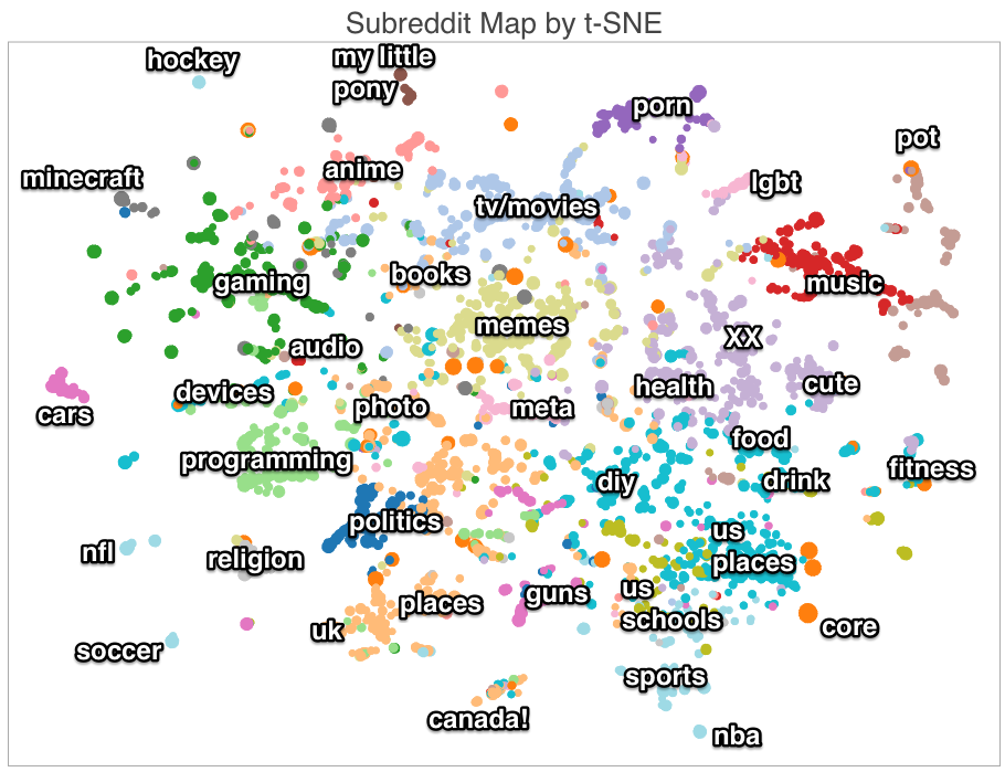
There is another multidimensional scaling algorithm in recent interest especially for model introspection in neural networks: tSNE (t-Distributed Stochastic Neighbor Embedding). First, we'll look at a map of the closeness of different forums on reddit (subreddits) based on common subscriptions.
We could quibble with some seemingly missing adjacencies - such as hocket and canada or sports (though they have the same category color label). The larger issue is that there is obviously much richer information in the relations found between sets than 'near' or 'far', but that is all that be communicated. From the creator's explanation, a dense embedding in 100 dimensions using SVD was created. The distances within that space could have been used in a distance matrix, and may have been more useful overall, especially if it were displayed using the clusters found by KMeans (as described).
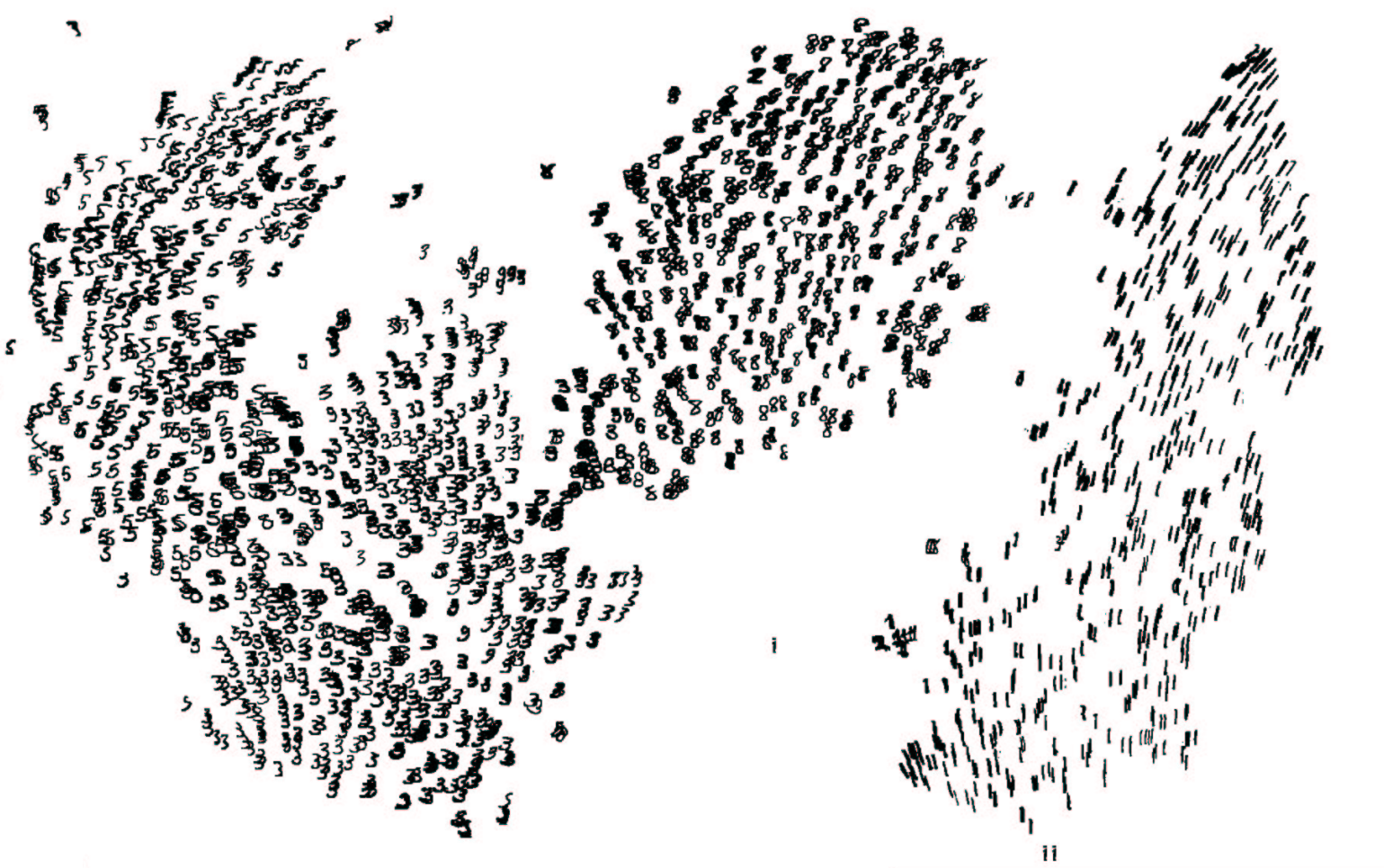
Next, a visualization of the MNIST handwritten digits data set.
Visualizations for image recognition using neural networks seem to break my curmudgeonly hypotheses. This use of tSNE for MNIST similarity representation works well because visual inspection of the input examples flows smoothly between points in the input space and is meaningful. I can tell what characteristics of the '3' digit and the '8' or '5' digit correlate with similarity or presence on the class boundary, and the "main dimensions of variation within each class" are visually discernible. The entire 60000 example data set was used to create the model, but only a subset were shown, which makes the display reasonable. Inspection of each element and visual comparison between pairs makes this useful in ways that non-image data cannot be.
This is a topic I'd like to revisit with other data sets, but wanted to make a first pass here.
Is multidimensional scaling useful? The raw data form is an adjacency (discretized, usu. binary) or distance (continuous, inverted from adjacency) matrix. If we use a cluster detection algorithm on our distance matrix, we can sort it into groups and arrange the elements to relate adjacency and closeness on the axes. Here we have one such sorted adjacency matrix by Mike Bostock on the co-occurrence of characters in Les Miserables.
 |
| http://bost.ocks.org/mike/miserables/ |
With fewer than 100 elements, this approach can work well. We can recognize the existence of clusters in the data, and begin to look between clusters if there are concentrations of adjacency or low-distance off the major diagonal. The cluster detection algorithm sorts the character Valjean into the green group, but we can recognize a concentration through him with the purple group. Several characters in the yellow group also have relation to the purple group. These concentrations will likely be sparse in most data sets, so this method of finding relations between clusters should hold up well. Between 100 to ~500 elements this matrix display could still work, but should make use of shading and blurring rather than discrete boxes to preserve space.
Could we map from the values of an adjacency matrix to Euclidean distances of element on a graph, a preserve the information we have? Properly, no. We lose information because the system is overconstrained by the distances between all of the elements. We only preserve clusters, and a binary form of close v. far. With many classes (clusters that should arise), and many features, the probability of high 'tension' or poor solubility of the mapping to distances on the embedding grows. This tension happens when an element or cluster both pushes and pulls from different elements in another cluster. Compression of a distances in N-dimensional space to two dimensional space necessarily loses information. In practice, we can not learn useful information between different values of 'far', only if a pair is close or far. Does this hold up?
Here, we show the same data as above, in another visualization by Mike Bostock, called a Force Graph, which is a form of multidimensional scaling. Unfortunately, it appears that the clusters have different color labels.
 |
| http://bl.ocks.org/mbostock/4062045 |
What useful information can be gathered here? With a mouse-over labeling of the characters, we might learn a bit more, but this is too cluttered. Before, I had the impression that the data was fairly sparse, but from the nest of lines, whose shades should convey force information, I might think differently.
There is another multidimensional scaling algorithm in recent interest especially for model introspection in neural networks: tSNE (t-Distributed Stochastic Neighbor Embedding). First, we'll look at a map of the closeness of different forums on reddit (subreddits) based on common subscriptions.
 |
| http://nicolas.kruchten.com/content/2014/12/subreddit-map/ |
Next, a visualization of the MNIST handwritten digits data set.
 |
| http://colah.github.io/posts/2015-01-Visualizing-Representations/ |
This is a topic I'd like to revisit with other data sets, but wanted to make a first pass here.
Thursday, December 10, 2015
Decision Trees and Random Forests: The Problem
Talk given to the Olin College Machine Learning Reading Group.
Here we'll investigate visualization and model introspection of one of the most popular and useful machine learning models: Random Forests, and their constituent Decision Trees. I use Random Forests for many first-pass models, because there is only one hyperparameter in need of tuning, the max depth. Increasing the number of estimators (decision trees) does not overfit. The only danger comes from allowing the trees to expand fully, past inferences that are generalizable. K-fold cross validation over range(5,36,5) max depth often suffices.
Suppose we don't yet care about the ensemble method, and just want to know about a single tree. How might we go about visualizing it?
The simplest method would be to show the data structure itself: all of the nodes, their features, their splits, the gini impurity at each node, the volume of test samples that passes through them, and maybe which class has the majority in each node. Within sklearn, tree.export_graphviz with the dot package converts a tree (which can be extracted from an RF ensemble) into its graphical form. Not very pretty; we see what is happening.
 But, this fails with the exponential horizontal expansion of the tree at greater depths.

Recently sklearn's documentation was updated to include this much nicer visualization on the toy Iris dataset:
 Which includes coloration based on class affiliation, significantly improving the usefulness of the visualization. By not perfectly aligning the nodes, we free up space. This could yield one or two more layers in depth before unusability due to expansion, but the problem persists.
We could take a different approach and look at the volume running through the nodes colored by their classes, in order to focus on the parts of the tree that matter most.
 And also emphasizing the split features:
 Good luck making sense of the relations or reading the labels past a depth of about 6. We know there is useful information beneath these depths, because trees and forests we train are much more powerful with this expansion, but it can't be expressed easily. We'll keep trying.
In the excellent decision trees tutorial by r2d3, the creators offer a tree with histogram nodes. The interactive visualizations are impressive, and quite good for teaching purposes.

The insight into the feature space is much better than the previous, as the histograms take a stab at showing how well the model operates in the input data set, rather than just showing the model space.
Offsets between the nodes and the outputs make the arrangement a bit nicer and free up some width. The exact visual arrangement needs some work given the overlaps that exist, but I'd say this is preferable to what we've seen so far. The utility to a data scientist is a bit higher, but still not great.
There's one last presentation that I think would be useful because of its clever transformation. In the visualizations reviewed so far, the limiting factor was the available width. Here, we can gain more visual space by radial arrangement.
 The Sunburst visualization by BigML takes the distribution of the volume of samples, arranges it radially, and gains space with each level of depth with the increasing circumference of the each ring. This buys us 2-3 more levels before failure. The interactive visualization is quite shiny, and allows switching between class distribution, confidence/mixedness, and feature to be split. Unfortunately, reading the feature splits off hierarchically is a bit more difficult, but there is help text off the figure. It allows zooming by clicking on one region, but overall exploration of the tree is difficult.
Trying to show the data structure directly preserves the relational information between features, and shows how the model makes predictions, but tries to do too much. I hypothesize that we need to know only the most important relational information, which is contained in the highest nodes of the tree, and most of the information on feature importance. How the model predicts is given the spotlight, whereas if you'd like to know (or estimate) what the model predicts on a given input, you can only try to follow the decisions through most of the tree if you have a practical number of features. The sunburst UI is pretty, but it finding the prediction for a desired input is not straightforward. With categorical variables, the number of features explodes - see the difference between the nice linear thresholds possible on the housing dataset (r2d3) versus all of the features in the forest cover dataset (linked sunburst). The histograms of r2d3's visualization mix showing the why of training data with the what of the confidences of the predictions on new data. We make a bit of progress on these dimensions, but I don't trust it to scale to larger, practical data sets.
The obvious choice for visualization - just showing the data structure (a weighted, directed digraph), in progressively more clever ways - doesn't help anyone iterate on the modeling process. Can we do better?
Random Forests present a challenge by increasing the complexity. I've yet to find a satisfactory decision tree visualization, much less for random forests. We'll examine if we can present the data that could be used as evidence in an argument, rather than as decoration.
Here we'll investigate visualization and model introspection of one of the most popular and useful machine learning models: Random Forests, and their constituent Decision Trees. I use Random Forests for many first-pass models, because there is only one hyperparameter in need of tuning, the max depth. Increasing the number of estimators (decision trees) does not overfit. The only danger comes from allowing the trees to expand fully, past inferences that are generalizable. K-fold cross validation over range(5,36,5) max depth often suffices.
Suppose we don't yet care about the ensemble method, and just want to know about a single tree. How might we go about visualizing it?
The simplest method would be to show the data structure itself: all of the nodes, their features, their splits, the gini impurity at each node, the volume of test samples that passes through them, and maybe which class has the majority in each node. Within sklearn, tree.export_graphviz with the dot package converts a tree (which can be extracted from an RF ensemble) into its graphical form. Not very pretty; we see what is happening.


Recently sklearn's documentation was updated to include this much nicer visualization on the toy Iris dataset:

We could take a different approach and look at the volume running through the nodes colored by their classes, in order to focus on the parts of the tree that matter most.
In the excellent decision trees tutorial by r2d3, the creators offer a tree with histogram nodes. The interactive visualizations are impressive, and quite good for teaching purposes.

The insight into the feature space is much better than the previous, as the histograms take a stab at showing how well the model operates in the input data set, rather than just showing the model space.
Offsets between the nodes and the outputs make the arrangement a bit nicer and free up some width. The exact visual arrangement needs some work given the overlaps that exist, but I'd say this is preferable to what we've seen so far. The utility to a data scientist is a bit higher, but still not great.
There's one last presentation that I think would be useful because of its clever transformation. In the visualizations reviewed so far, the limiting factor was the available width. Here, we can gain more visual space by radial arrangement.

Are These Decision Tree Visualizations Useful?
Maybe these are useful within the context of a tutorial, but a great deal of inspection work is required, even with the interactive sunburst visualization. Exploring these trees becomes impossible past depths of ~10. If we could combine the zooming and labeling of the sunburst with the histograms of r2d3's tree, we could make some headway into seeing the model in the data space, but moving through the tree would still be quite tedious.Trying to show the data structure directly preserves the relational information between features, and shows how the model makes predictions, but tries to do too much. I hypothesize that we need to know only the most important relational information, which is contained in the highest nodes of the tree, and most of the information on feature importance. How the model predicts is given the spotlight, whereas if you'd like to know (or estimate) what the model predicts on a given input, you can only try to follow the decisions through most of the tree if you have a practical number of features. The sunburst UI is pretty, but it finding the prediction for a desired input is not straightforward. With categorical variables, the number of features explodes - see the difference between the nice linear thresholds possible on the housing dataset (r2d3) versus all of the features in the forest cover dataset (linked sunburst). The histograms of r2d3's visualization mix showing the why of training data with the what of the confidences of the predictions on new data. We make a bit of progress on these dimensions, but I don't trust it to scale to larger, practical data sets.
The Wrong Question
In practical machine learning, decision trees are 'poorly conditioned' (too fragile and dependent on the feature distributions within the input set) and prone to overfitting, so they are not used when random forests could be. I chose this exploratory sequence to illustrate that even data scientists, rather than simple admirers of data visualization, chose graphical representation of their models that do not serve a purpose. That any of these visualizations were used to improve a model, redesign a feature engineering approach, or make a convincing argument to a client would shock me.The obvious choice for visualization - just showing the data structure (a weighted, directed digraph), in progressively more clever ways - doesn't help anyone iterate on the modeling process. Can we do better?
Random Forests present a challenge by increasing the complexity. I've yet to find a satisfactory decision tree visualization, much less for random forests. We'll examine if we can present the data that could be used as evidence in an argument, rather than as decoration.
Machine Learning Model Introspection: Framing
I'm motivated by a perceived lack of study and effort in the machine learning community to care about visualization and use it effectively. If I can score in the top of a data science competition while only using pre-packaged models and summary statistics, why do I should I care about visualization? Well, if we can call machine learning 'automated pattern recognition', then we ought to see the patterns recognized. We want to understand if the model is arriving at generalizable predictions, and be able present those patterns to others. Even for single-minded chasing of performance metrics, we can use visualization and model introspection to tighten the feedback loop from the feature engineering, parameter tuning, and model structure to quality of predictions.
A machine learning model should contain information about a generalizable pattern that is recognized to produce some output. Visualization should represent these patterns. Ideally, viewers are able to map from points in the input space to predictions generated. However, models are often too complex for this. Even so, an effective visualization or model introspection should show the most important feature correlations, strengths, and feature interactions. We'd like to know where the model does well on some test set, and where it fails. We may even want to know how it extracted the patterns that it did. Most importantly, the visualization should be useful for improving the model or evaluating the design of the machine learning approach.
So we can come up with a few criteria:
- What the model predicts: mapping from the input space to the output space
- How it predicts: the rules and structure within the model that generate the prediction
- Why it predicts: the relation between the training data and the extracted patterns
- Where it fails: how the performance of the prediction varies within the state space
A series of visualizations that addresses each of these criteria can be sufficient, and may even be simpler, but integration excels when possible.
Though we may think that we should just pass off the n-dimensional pattern recognition problem onto our machine learning models, we can still fight the good fight of compressing high-dimensional information onto our ~two dimensional projections. Our own faculties still work.
In sum, I'm looking for opportunities for mutual augmentation of human and automated pattern recognition.
Intro
Visualization from a skeptical point of view.
Machine learning model introspection, parsimonious data ink, utility over decoration.
Previous work on Chord Diagrams.
Machine learning model introspection, parsimonious data ink, utility over decoration.
Previous work on Chord Diagrams.
Subscribe to:
Posts (Atom)